Newson typeface family remastered and screen-optimized
When we customized Newson for General Logistics Systems it became clear that the typeface would need a general update.
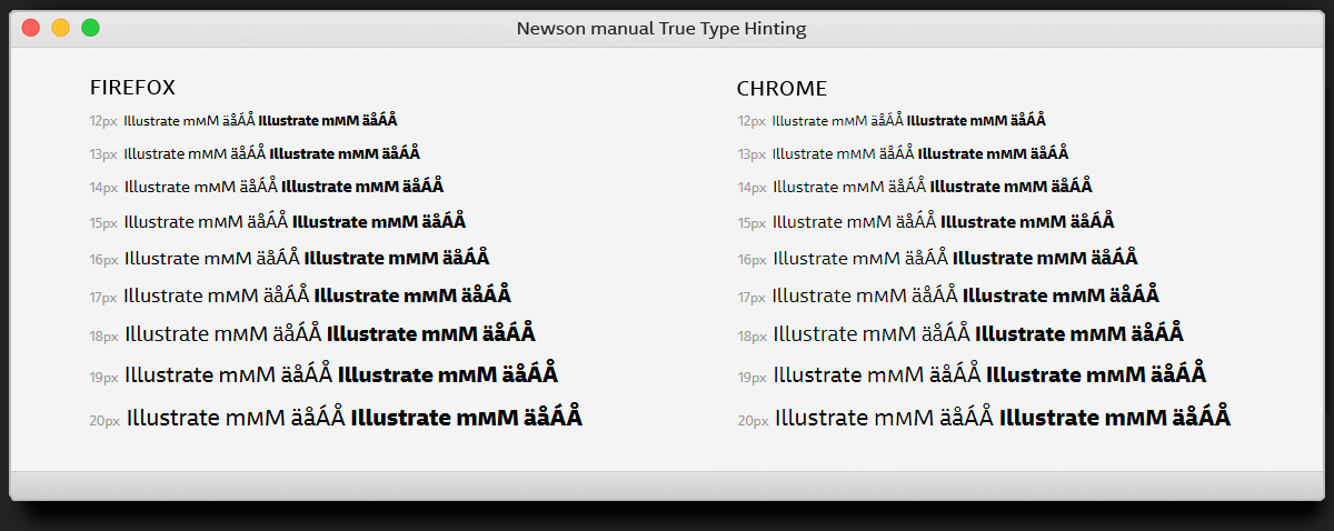
For this update, which is available from now on, several design details have been reworked and adjustments of the vertical metrics have been made in order to achieve a better consistency when used on screen or in print.
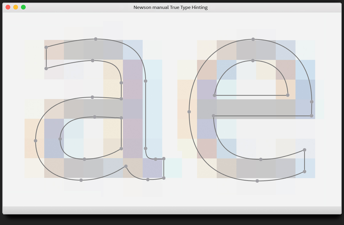
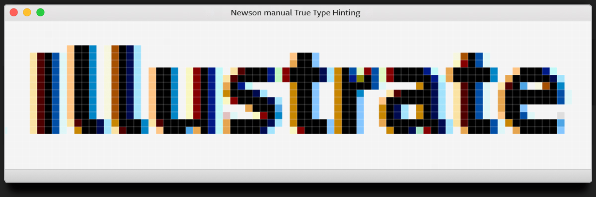
All weights of the Newson typeface family have been manually True-Type hinted, which optimizes the on-screen appearance of the fonts. The new version now provides optimal legibility and visual performance on Windows-based devices.
Manual True-Type hinting is a meticulous process of fine-tuning to optimize its legibility and visual quality on digital screens. Each glyph was carefully adjusted to align with the pixel grid, ensuring precise rendering at different sizes and resolutions.
Clients who have already licensed Newson before can update to the new version without any additional costs.
Please get in touch with us: info@revolvertype.com.