Ritual in use for Atticus
Primary Works developed the rebranding for Atticus, a rapidly growing Australian software company that helps professionals review and verify important documents.
Having outgrown their initial brand, they came to us with a need for a new look and feel that better represented the up-and-coming technology player that they’ve become. It needed to feel trustworthy and intelligent, while still having a sense of energy and approachability. It also needed to re-imagine their existing bird logo into a more distinctive and flexible symbol.
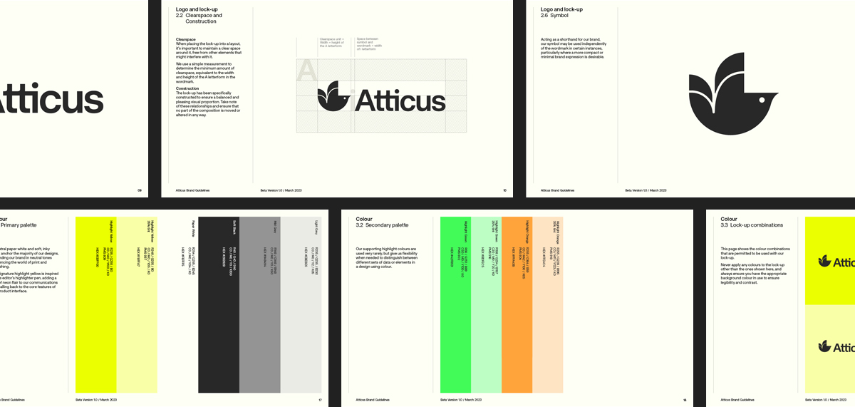
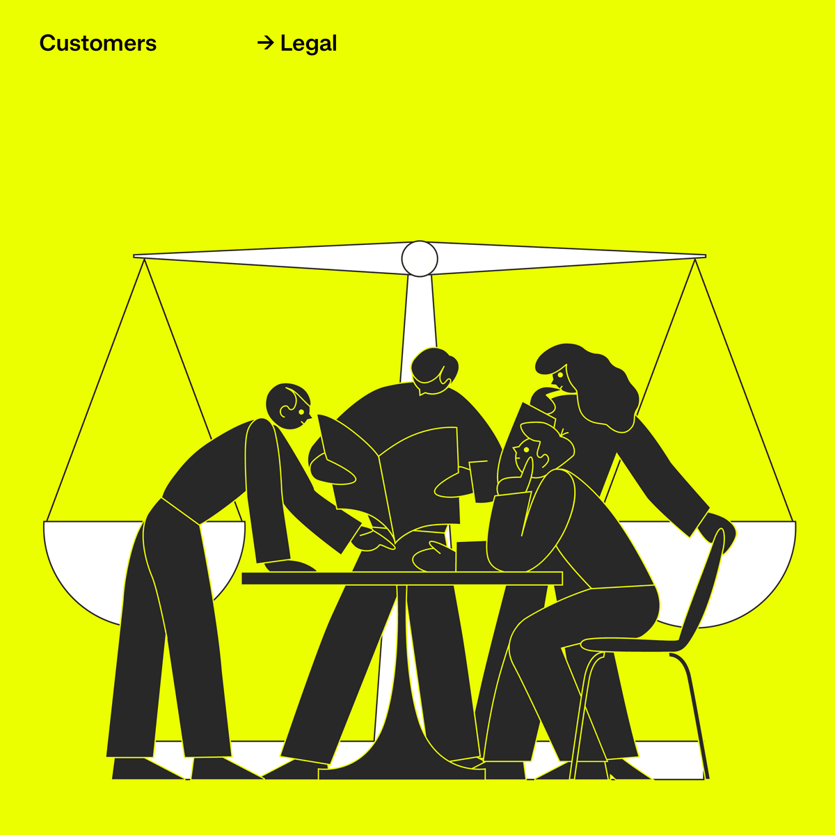
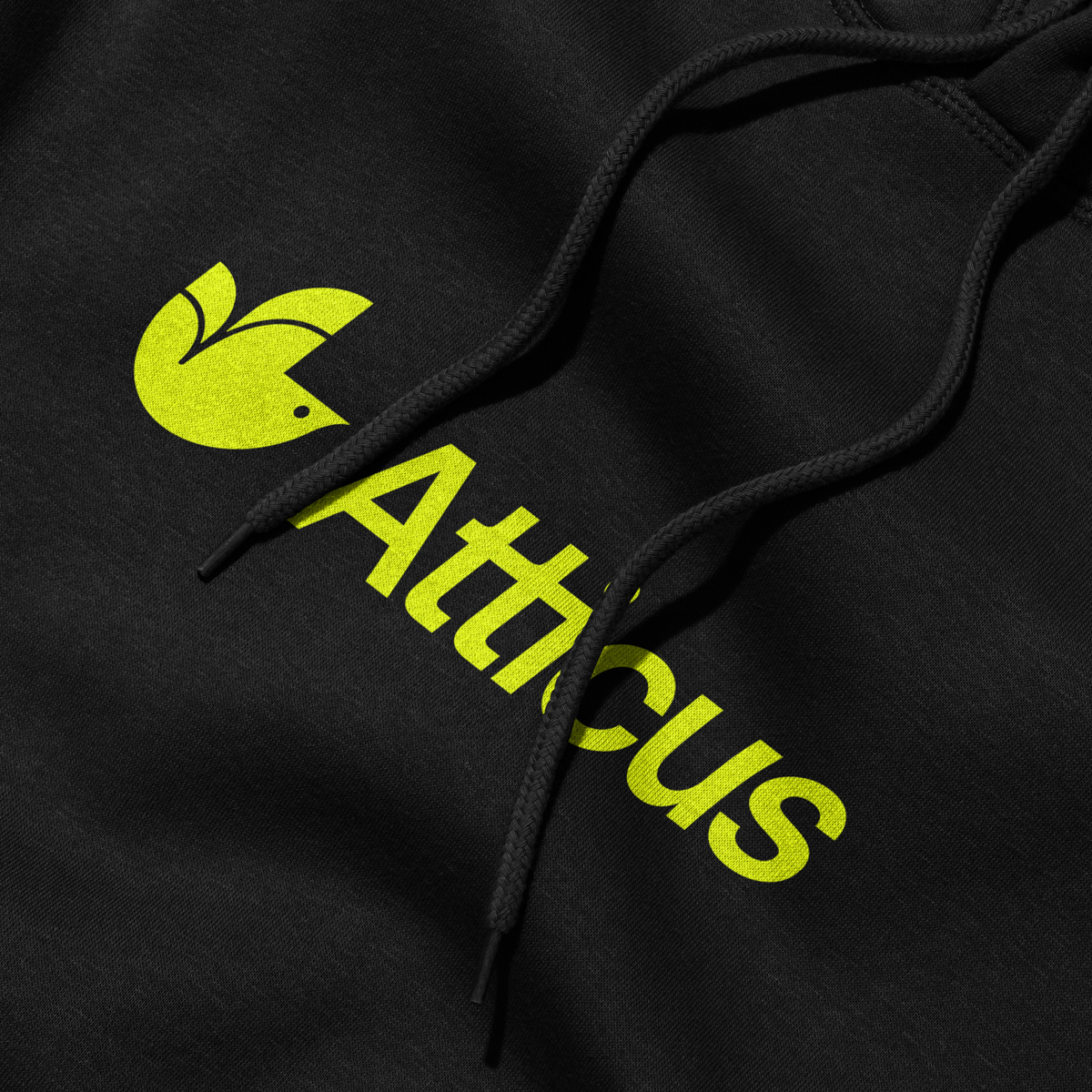
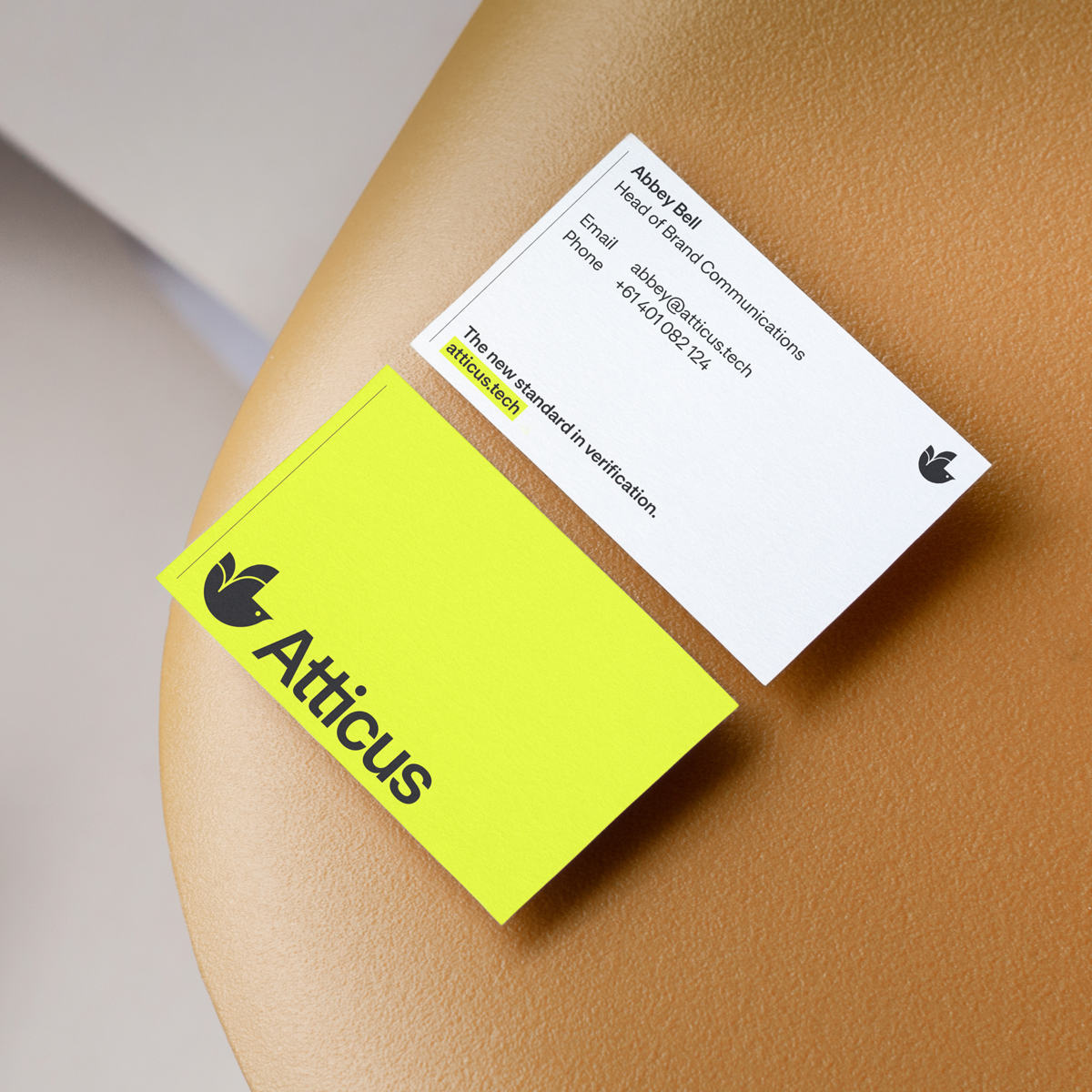
The new symbol is a simplified finch that incorporates the shape of a check mark, signifying verification and approval. Derived from the graphic style of this mark, illustrations from London-based James Graham bring to life to the customers and concepts of the brand. Sophisticated yet playful, they help tie the assets together and create moments of delight and discovery throughout the suite.