Typeface Damien in use.
The book design by Pixelgarten is the first official use of the Damien Font Family, actually before it was officially released. Damien started life in the Type and Media program at the Royal Academy of Arts (KABK) in The Hague. The family spans both Text and Display styles. Its look “evolved from a personal preference for pointy shapes, high contrast and straightforwardness.” Damien’s striking features include a wedge-shaped ‘t’ bar, a spiky arc for ‘a’, and diamond-shaped dots — latter are made available as an stylistic set.
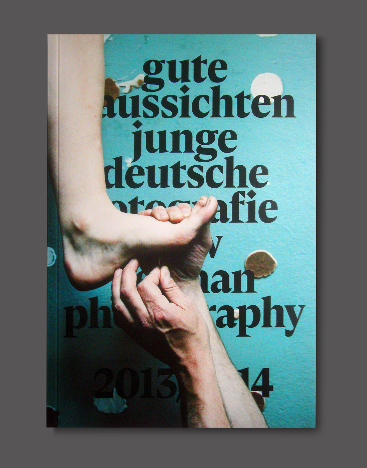
Gute Aussichten. New German Photography 2013/14 is published on the occasion of the annual media and exhibition project founded in 2004 to promote young photographers in Germany.
Cover: Poke and Bend by Nadja Bournonvill